2.28.2006
Recent Work
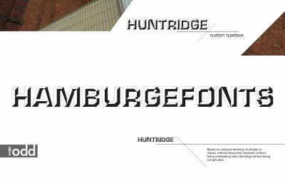
Here's a board for a typeface I designed for my Advanced Typography class. Think it turned out pretty well, with the glaring exception of the fact I realized that my body type in the lower right hand corner being altogether too huge after I'd printed it out and mounted it. Should probably be at least 3 point sizes smaller, but, it's done now, so, oh well.


Subscribe to:
Post Comments (Atom)

No comments:
Post a Comment